Your Cart is Empty

FURNITURE


The Essence of Design, Part 2 - Color Theory and Its Role in Design

Inour first post, we discussed the importance of gauging a room’s space, determining its purpose, and establishing the theme to realize your beautiful vision of a perfect home. Today, we’ll be discussing color theory, and how we can use it to select the colors that will help us evoke emotions and unify the furniture pieces that will be used to turn our concept into a beautiful room.
The Wide World of Color
Color is part of the natural beauty that allows us to connect with the world around us. Color not only allows us to distinguish between different objects we find in the world but influences how we perceive the world. They spur emotions that we later associate with certain objects or settings and create bookmarks to help recall specific memories later.
When it comes to interior design, we use color not only as a visual reference to create flavor, but also as a conduit to evoke certain emotions. I’m sure you have colors that you prefer in your home, but you may not know why. You don’t have to be an expert in colors, but by having a basic understanding of color theory, you’ll be able to narrow your focus towards a color palette that will match your theme beautifully.
The Color Wheel
The first step towards getting a better understanding of color, and how colors are both formed and relate to one another, is to understand the color wheel.
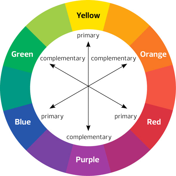
Image Source:Color: A Photographer's Guide to Directing the Eye, Creating Visual Depth, and Conveying Emotion (Jerod Foster // Peachpit Press // 2013)
As you can see, the color wheel is simply a visual representation of the common colors we find in the world. To break it down even further, colors fall into one of the following three categories:
Primary Colors
These are the three colors that will form any other color, of any variety, that you can imagine. The three primary colors are red, blue, and yellow.
Secondary Colors
These are formed by combining two of the primary colors. The secondary colors are green, purple, and orange.
Tertiary Colors
These are colors created by combining a primary and secondary color, and where we begin to really see a wide variety of colors come into play. For example - combining blue and purple will create violet. There are only six represented on the color wheel, but there are literally hundreds of thousands of possible tertiary colors.
Using the Wheel to Match Colors
Using the color wheel as a guide, you can see the basic relationship between colors across the rainbow spectrum, and with that, we can begin to understand why certain colors work together, while others clash, using three basic color schemes.
Complimentary Colors
The easiest way to find colors that compliment one another is to simply draw a straight line between two different colors on the wheel. For example, drawing a straight line from red will land you on green, a combination that we know works well together for Christmas decorations.
Analogous Color
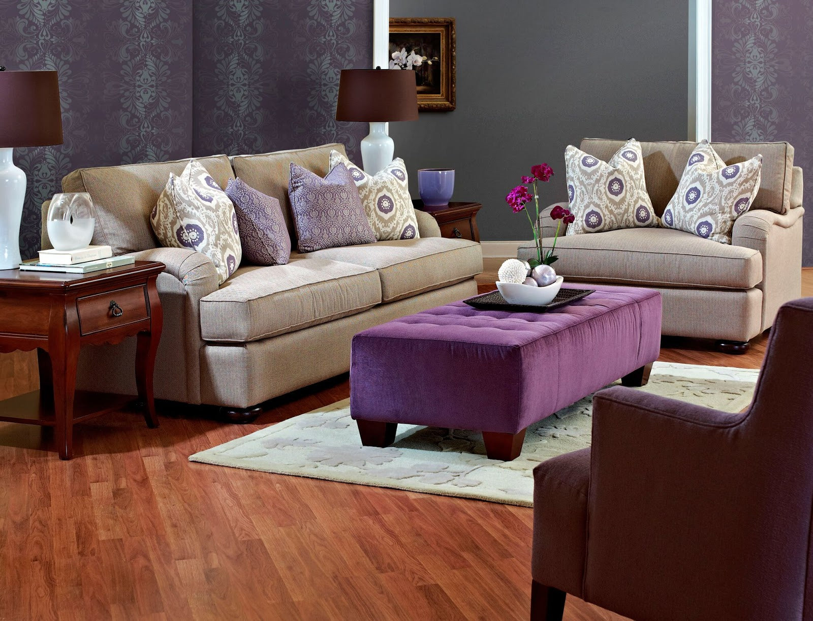
This refers to using colors that sit beside each other on the color wheel and is very useful if you want to stay within a particular spectrum, but add some diversity with different variations. For example: if you know for a fact that your room is going to be all in purple, you can find a tertiary purple that is closer to blue, as well as one that is closer to red, to bring more life and variety to your room while staying with the basic color of purple.
Triadic Colors
These are three colors, evenly spaced in a triangle on the color wheel, that when combined work very well together. While not an interior design reference, think about the Burger King logo - the words are in bright red, the bun is in yellow, and the circle is blue. It pops out at you, creates a memorable impression, and is made using three triadic colors from the wheel.
How Many Should I Use?
With so many options for color available, it can be a little daunting to just narrow in on a few, while using too many can overwhelm both you and your guests. Before you even try to decide, you need to decide what emotions you want your room to evoke.
Using Color to Evoke Emotions
As I mentioned in the introduction, we all have colors that we prefer, and make us feel a certain way, even if we’re not sure why. We’ve discussed different color palettes that can fit together, and to make those combinations effective, we need to understand what kinds of colors influence which emotions.
Cool and Warm Colors
The most basic distinction that can be made between colors is that they make us feel either hot or cool, both physically and emotionally.
Warm colors, such as bright reds, oranges, and yellows, tend to make us feel warm and energetic. We know that the sun, fire, and other sources of heat usually contain different shades of these colors, and so we come to associate them with feelings of warmth. These colors are best used when we want to convey a sense of energy that will inspire activity, such as in a children’s playroom.
On the opposite end of the spectrum, cool colors, such as blues, greens, and purples tend to make us feel more relaxed and at ease. We commonly associate these colors with the ocean and forests; places where natural tranquility reigns. Cool colors are perfect for rooms where you want to be able to relax, such as a bedroom or living room.
Altering With Shade, Tint, and Tone
While the 12 colors illustrated on the wheel above dominate the basic spectrum, there is an endless variety that you can create using shade (adding black), tint (adding white), and tone (adding gray). This not only leads to more variations but can completely change the emotions that a base color stimulates.
For example: we’ve established that red is a warm color that can foster energy and action, but by adding in some shade we create a darker, more subdued red, that suggests less explosiveness, and more a delicate passion or romance.
This is useful when you want to portray a particular feeling, but want to enhance or tone down that feeling, while staying in the same color spectrum. You might go with a darker shade of blue if you want your room to set you at ease, like you’re floating in a deep pool, or a lighter shade if you want to let your thoughts flow freely, as though you were floating in the sky. Either one will help you feel more relaxed.
The point I’m driving at is that, just because you commonly associate a color with a certain emotion, doesn’t mean that you can’t convey a different emotion with a slight variation on that base color. You can use this to your advantage when trying to enhance or subdue a certain emotion, depending on your theme and what you want to achieve.
Follow Your Own Heart
There’s a simple way to find a color that appeals to you, and then build off of that to create a beautiful color scheme that matches your vision perfectly: use your own emotions as a guide.
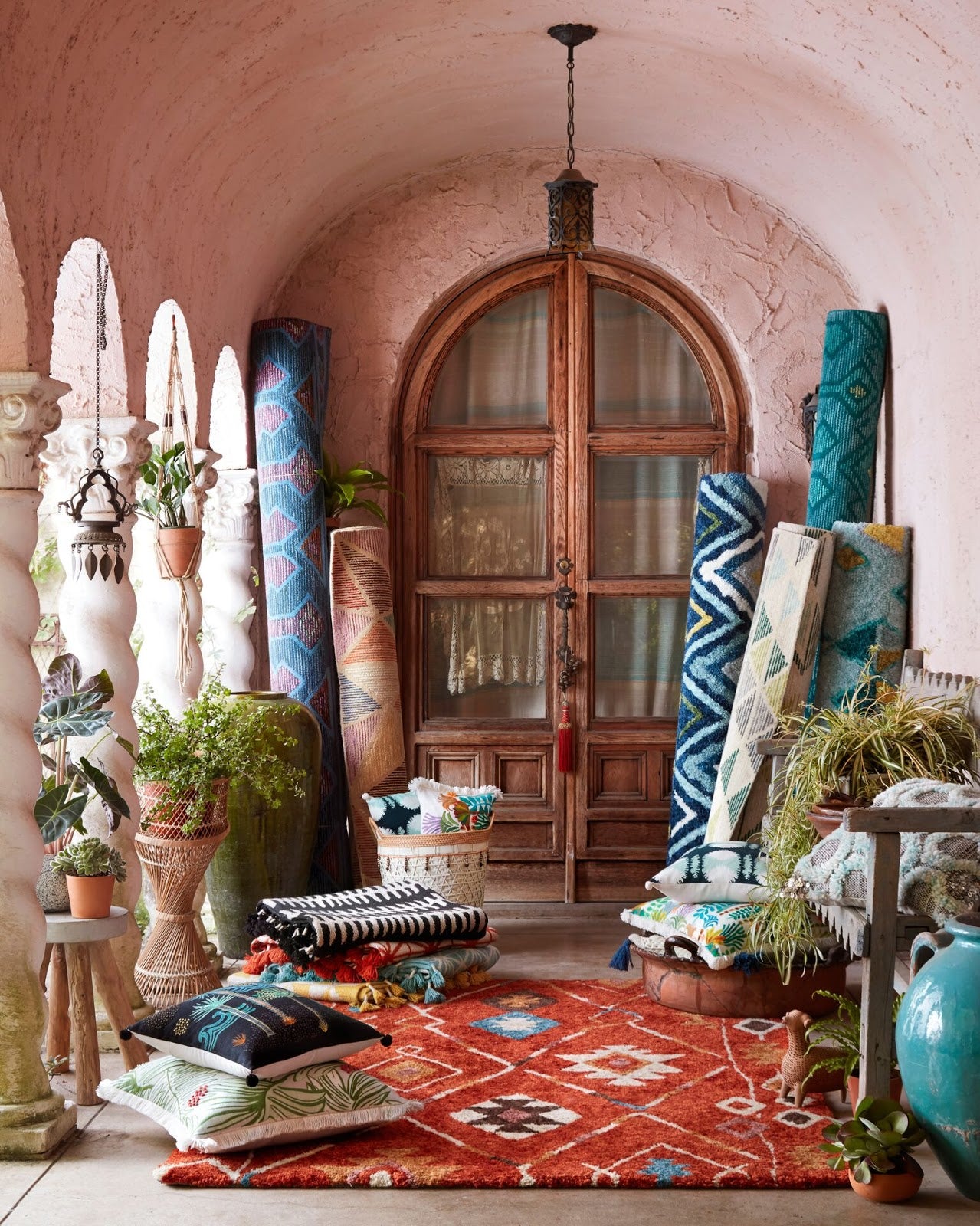
As you start to build your design, look at some of the different colors out there, and think about the types of emotions that they evoke in you. As you browse through our handmade Persian Rugs, you’ll notice that they come in a wide variety of colors. Some are more subdued, with muted, earth tones that make them seem natural, like they were molded from clay. Others draw from a wide palette of bright colors and patterns that almost seem to tell a story filled with action and drama as you look at them and demand your full attention.
Keeping your emotions in mind as you craft your design, and paying attention to the colors that appeal to you, will help you find the colors that you’ll want to build for your own home.
For example: You’ve decided that you want your living room theme to be subdued, using cool colors that set you and your guests at ease. A particular shade of blue you’ve found sets you more at ease than any other hue. You want to incorporate it into your living room, while not limiting it to blue colors only.
Using the color schemes we discussed above, you could either use orange (complementary) to help inject some fun or energy into your living room to foster conversation or go with shades of green or purple (analogous) to maintain that same peaceful mood, but introduce some variety.
The important thing is to focus on what emotions you want to convey within your theme, and then trust your own instincts to find that initial color that works for you. From there, you can expand to other parts of the color wheel or stick within the sphere that works for you.
By keeping the principles of the color wheel in mind, understanding how colors relate to one another, and trusting the emotions that they bring up within you, you’ll find that you will have a much easier time choosing the right color that will help you realize your beautiful home.
I hope you’ve enjoyed learning more about colors, and I’m eager to have you back for Part 3, where we’ll discuss material and texture choices in furniture, why they’re important in your design, and how patterns can tie with color and texture to convey emotion.